Product Detail

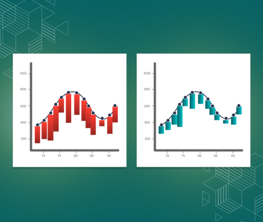
Hanging Rootogram Chart

Tool Is Certified by Microsoft:

Problem Statement

In data-driven project management and statistical analysis, effectively identifying and visualizing deviations between observed and expected data is crucial for making informed decisions. Traditional bar charts or line graphs can often clutter or oversimplify the representation of such deviations, leading to misinterpretations or oversight of critical insights. This challenge is compounded when dealing with large datasets, where maintaining clarity, accuracy, and performance becomes increasingly difficult.

Key Challenges:

  1. Visual Clarity: Standard charts may fail to clearly highlight the discrepancies between observed and expected frequencies, particularly in complex datasets.
  2. Space Efficiency: Managing extensive data within limited screen space often results in cluttered visualizations that hinder analysis.
  3. Dynamic Data Handling: Traditional tools may struggle with performance issues when rendering large datasets, impacting the efficiency of analysis.
  4. Customizability: Lack of flexible features like thresholds, scalable elements, and interactive tooltips reduces the ability to focus on critical data points or adapt to varying analysis needs.
Conclusion

The Hanging Rootogram chart by Office Solution offers a powerful and versatile tool for statistical analysis across various industries. Its ability to clearly visualize deviations, handle large datasets, and provide customizable features makes it invaluable for enhancing project management effectiveness and supporting data-driven decision-making.

Key Benefits

  1. Visual Clarity:

    • Immediate Insights: The hanging bars allow for clear visualization of deviations from expected frequencies, making it easy to identify data discrepancies.
  2. Compact Layout:

    • Space-Efficient Display: Ideal for managing complex datasets within limited space, maintaining clarity and effectiveness in data presentation.
  3. Dynamic Data Handling:

    • Smooth Performance: Handles large datasets efficiently with quick rendering, ensuring effective analysis without performance lags.
  4. Customizable Features (Premium):

    • Thresholds: Highlight significant deviations by setting specific thresholds, focusing attention on critical data points.
    • Dimensions: Adjust chart dimensions to fit various screen sizes and layouts, enhancing adaptability to different viewing environments.
    • Interactive Elements: Detailed tooltips available on hover, providing precise values and additional insights for deeper analysis.
    • Scalable Bar Height: Customize bar heights relative to the normal distribution curve or absolute values, offering flexible visualization options.
    • Color Coding: Use color-coded bars for instant identification and easier analysis of data trends.
  5. Curve Visualization:

    • Observed vs. Expected Data: Compare observed and expected data directly with distinct lines for a comprehensive analysis.
    • Area Between Curves: Shaded areas highlight discrepancies between observed and expected lines, simplifying the identification of significant deviations.

Business Use Cases

  1. Quality Control:

    • Defect Rate Monitoring: Compare actual defect rates against expected distributions to improve quality control processes and identify areas for enhancement.
  2. Data Science & Statistics:

    • Model Validation: Assess statistical models and detect anomalies or outliers, ensuring the accuracy and reliability of data analyses.
  3. Marketing & Customer Analytics:

    • Behavior Analysis: Analyze deviations in customer behavior to refine marketing strategies and improve targeting efforts.
  4. Healthcare & Medical Research:

    • Outcome Analysis: Examine health outcomes or medical test results for patterns and trends, contributing to better research and patient care.
  5. Supply Chain Management:

    • Efficiency Identification: Detect inefficiencies and opportunities for optimization within supply chain operations to enhance overall performance.

Other products

Office Solution Capacity Monitoring tool enables organizations to track Centrally:-

Lorenz Curve Chart

Lorenz Curve by Office Solution

T

Icon Array Chart

Icon Array Chart by office solution transforms traditional data repres

Magic Grid Advanced Analytics ChatGPT Solution

Magic Grid Advanced Analytics ChatGPT Solution

Spiral Plot Chart

The Spiral Plot by Office Solution offers a unique way to visualize da

Fishbone chart

The Fishbone Chart, also known as an Ishikawa or cause-and-effect diag

Polar Plot Chart

The polar scatter plot is a type of chart that displays data points in

Bar Chart Convertible with Scatter plot

Transform your Bar Chart into a dynamic Scatter Plot for enhanced data

Tree View With Bar

Custom Tree View and Bar Chart, offering flexibility in managing column width and height, along w