Tool Is Certified by Microsoft:

For more information visit our Microsoft app source link https://appsource.microsoft.com/en-gb/product/power-bi-visuals/officesolution1640276900203.lorenz-curve-by-office-solution?tab=Overview
Office Solution Capacity Monitoring tool enables organizations to track Centrally:-
A Voronoi diagram is a way of dividing a plane into regions based on d
The Barley Trellis chart, inspired by Becker et al.'s groundbreaki
The "Custom Slicer by Office Solution" is a certified Power
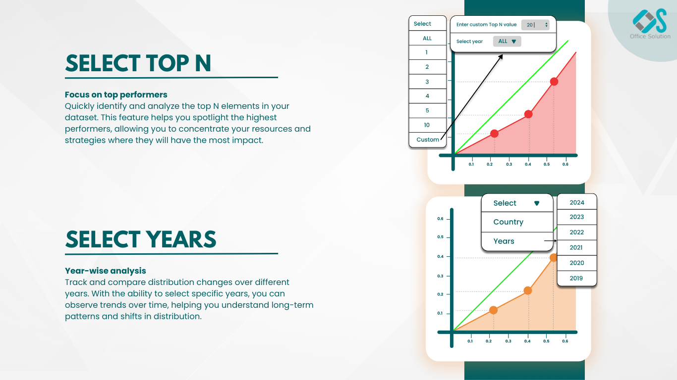
Select Top N number of items to be displayed in chart and rest items w
The polar scatter plot is a type of chart that displays data points in
A profit and loss statement summariz
Connected Scatter Plot chart
Power BI Premium Capacity Analytics Solution Reduce your Power BI prem