
Bar Chart Convertible with Scatter plot
Bar Chart Convertible with Scatter plot
Transform your Bar Chart into a dynamic Scatter Plot for enhanced data analysis, with adjustable average lines, dynamic axis changes, focus on top areas and precise KPI comparisons

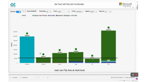

Bar Chart Convertible in Scatter Plot by Office Solution helps users to convert Bar chart as Scatter plot chart or Column Chart at run time for better data analysis
Key features:
1. Business users can change bar chart to Scatter plot chart for better analysis
2. Business users can change bar chart to Column chart for better analysis
3. Users can draw an additional Average line at each individual bar level or overall chart level
4. Users can compare individual KPI is going up or down in respect to another KPI
5. Business users can change X Axis dimensions/Measure dynamically at run time
6. Business users can change Y Axis dimensions/Measure dynamically at run time
7. Business users can change X Legends dynamically at run time
8. Business users can focus only top 5 or top 10 areas
9. Users can use an additional KPI which can be draw in the form of Icons at the last of bar with conditional formatting applied , it helps in assessing if our key KPI indicators are doing well or not.
For more information visit our Microsoft app source link are:https://appsource.microsoft.com/en-us/product/power-bi-visuals/officesolution1640276900203.bar-chart-run-time-convertible-in-scatter-plot?tab=Overview