
MultiKPIGrid
MultiKPIGrid


Profit and Loss Statement Dashboard
A profit and loss statement summarizes all the activity recorded in your income and expenses accounts over the specified time. Income typically includes sales while expenses might cover things like payroll, advertising, rent and insurance.
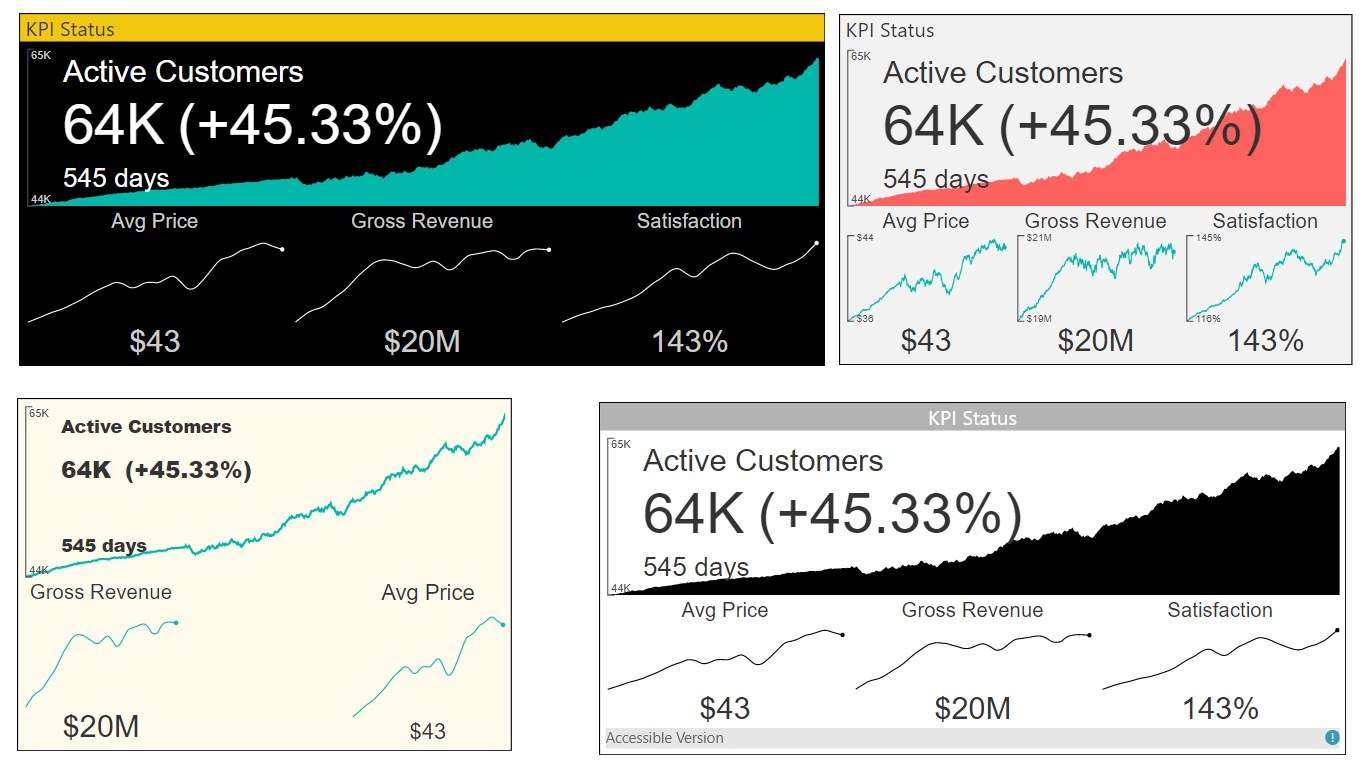
A powerful Multi KPI visualization, of a key KPI along with multiple sparklines of supporting data.
The Multi KPI custom visual is for presenting a key performance indicator (KPI) along with a variety of supporting information, including:
1. Title, Subtitle
2. Sparklines
3. Current date and KPI status (value, date, variance)
key features:
1. KPI trend over time: hover-over the main chart to see a KPI for each date.
2. Rich Formatting Options: set alternate titles, and tooltips, font sizes, colors, background colors.
3. Numerous Chart Features: multi KPI support number types, precision, Y-axis tick marks, and hover-over tooltips.
4. Sparkline Interpolation: Interpolate sparkline values to get rid of noisy points.
5. Auto-Scaling: design a larger tile in your report with rich details. After pinning it to a Power BI Dashboard, you may resize it to smaller versions of the tile without losing essential details.